03 / Selected case · Creative development · Motion · Bilingual
An event brand should not sit still.So the interface never does.
A bilingual event-production website where pace, motion and interface work together as one cinematic brand experience.
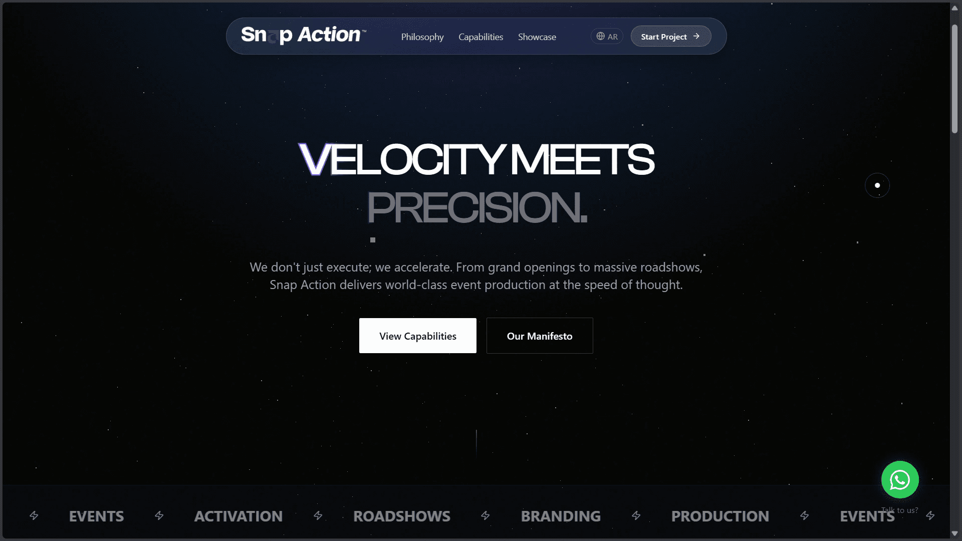
The live experience
Pace is part of the message.
The product film shows how headline transitions, spatial depth, capability reveals and the bilingual switch work as one continuous experience.
English and Arabic interfaces moving through the same visual rhythm.
The product
A digital expression of precision under pressure.
Snap Action produces events, activations, roadshows and branded experiences. The site translates that operational energy into a focused narrative instead of presenting services as a static corporate catalogue.
- Role
- Creative frontend development
- Platform
- Responsive brand website
- Languages
- Arabic + English
- Direction
- Motion-led dark interface
Creative challenge
Cinematic, not chaotic.
Fast, not disposable.
The visual system needed enough movement to express the brand while preserving readable content, usable controls and equivalent storytelling in both directions.
Motion with purpose
Every reveal must support pace, hierarchy or spatial meaning—not decorate the screen.
Two directions
The composition has to feel intentional in English LTR and Arabic RTL.
Visual restraint
Atmosphere, particles and contrast cannot compete with the service narrative.
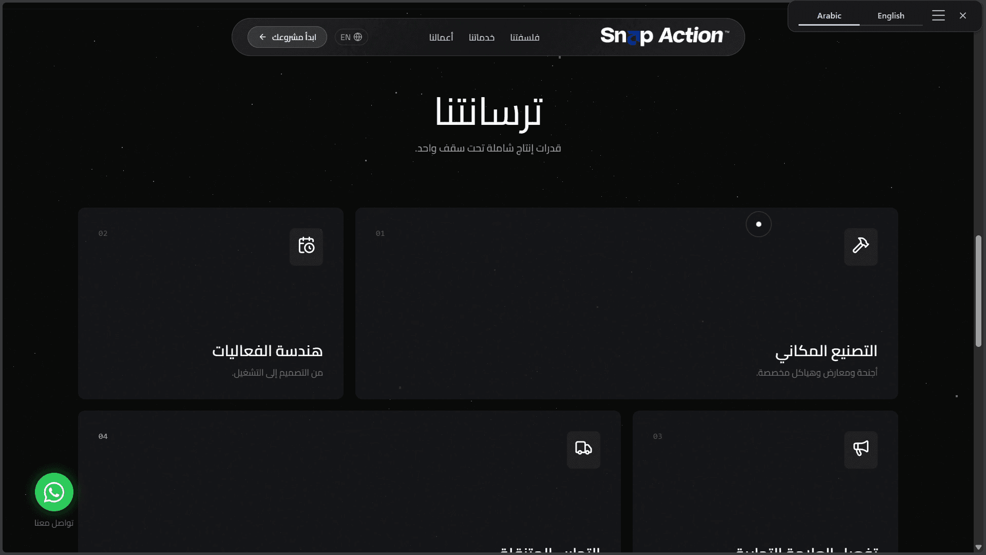
Bilingual composition
Same brand velocity. Native reading direction.
The language change mirrors navigation, alignment, controls and content rhythm instead of translating words inside an unchanged layout.
Motion language
One choreography across the whole site.
The system combines controlled typography, spatial layers and responsive timing. Motion remains a brand behavior, not a one-off hero trick.
Headlines change weight, position and contrast to create tension and release.
Particles and soft fields create space while keeping the content plane stable.
Copy, cards and calls to action enter in a readable order through scoped GSAP timelines.
Smaller screens receive shorter distances and quieter effects while preserving the story.
Capability system
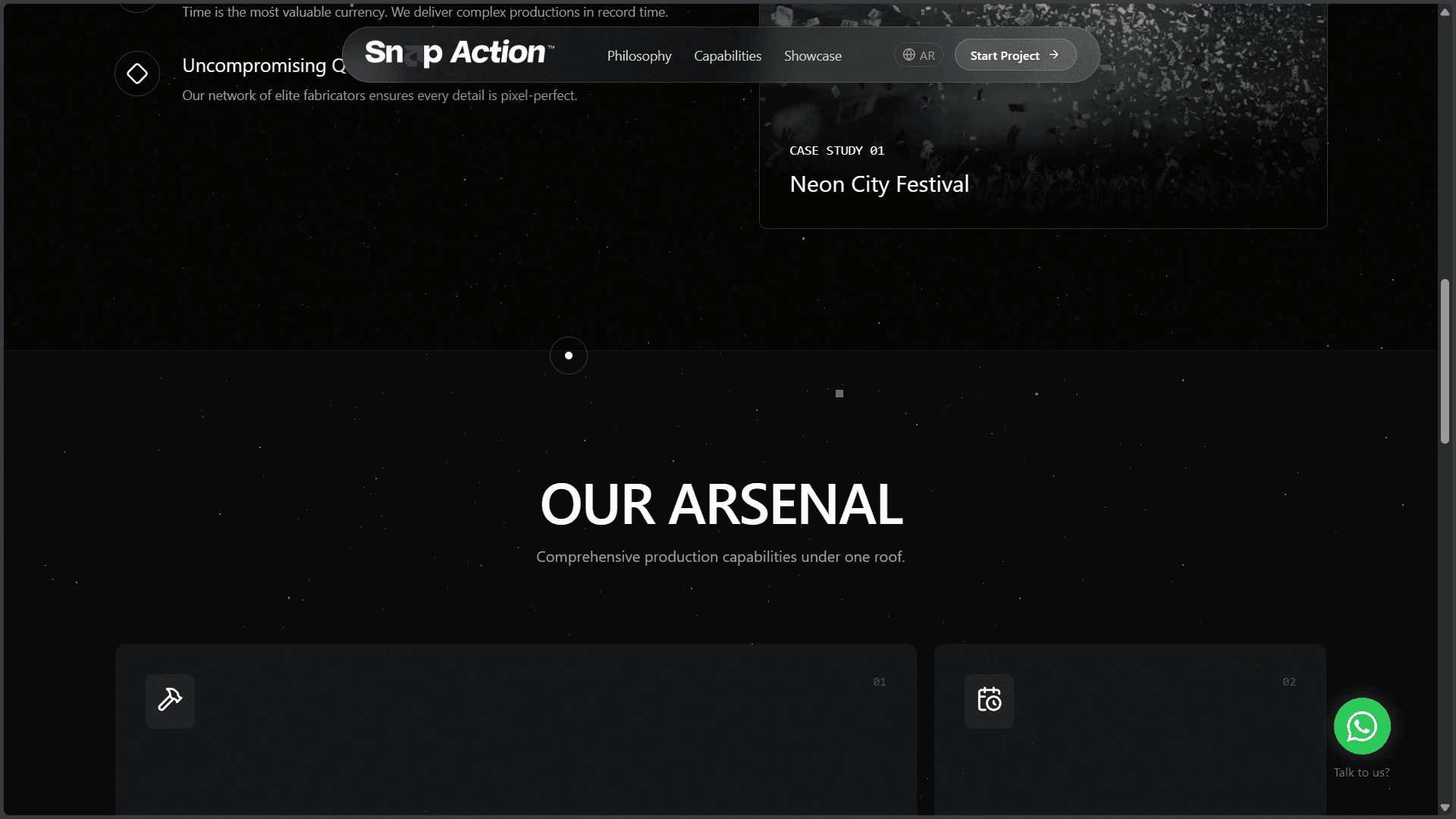
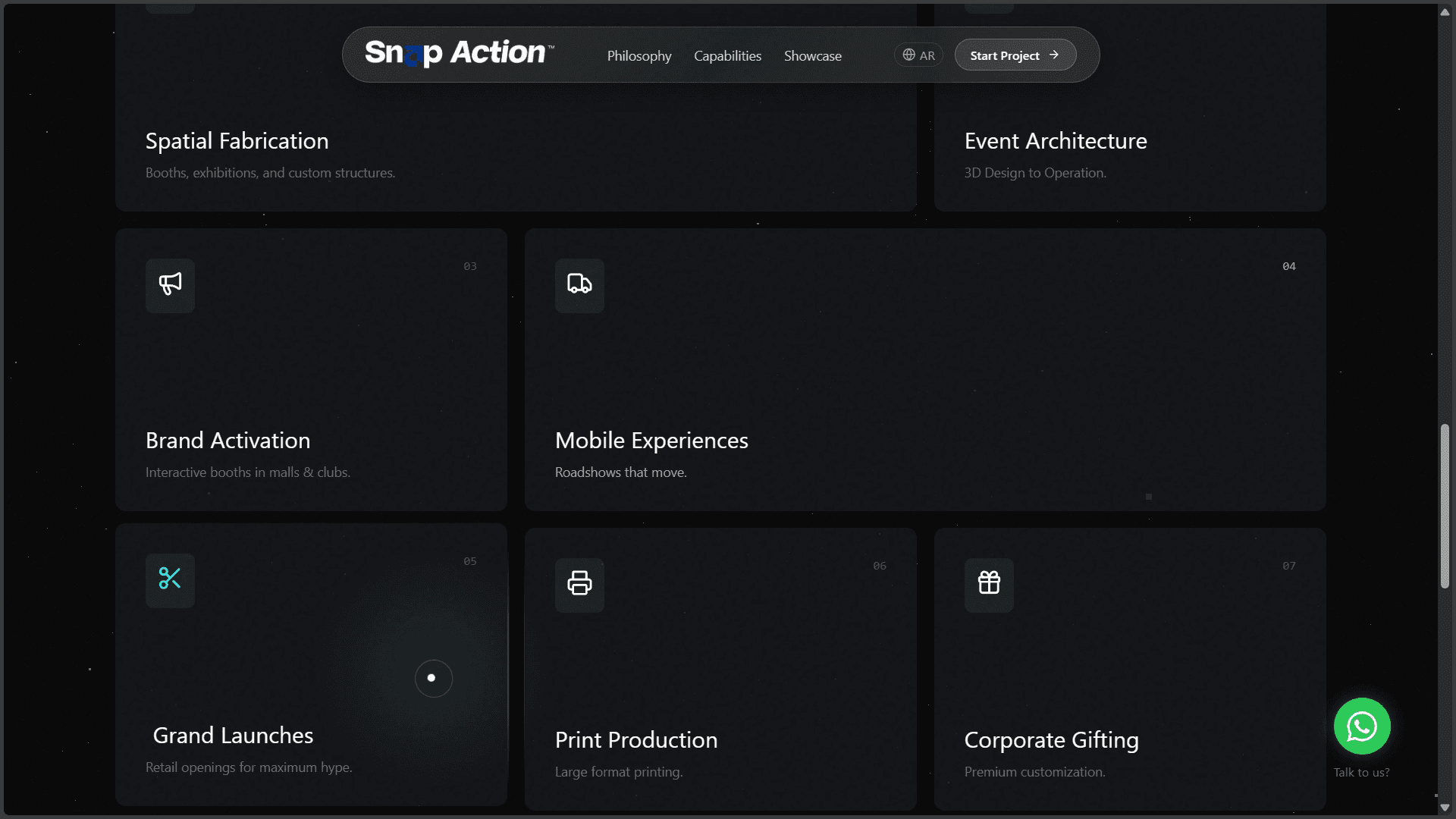
From promise to a clear production arsenal.
Services are organized as a modular grid so a wide offer still feels scannable. A concise protocol section connects the brand promise to the way the team works.
Outcome
A brand website that behaves like the work it represents.
Snap Action feels energetic without losing its structure: a bilingual narrative, a reusable motion grammar and a capability system that stays understandable.
Built to move.
Made to land.